Back to reality, but not finished

I’m back in Chicago. My experience at the residency was wonderful and I loved every minute. I loved being with all of the younger women, the change in my routine was great and the need to work full days, no naps, was stimulating and energizing.

I still have one more decision before the book is finished by Chris Petrone and the great people at WSW. The cover image and color remain a question. We began with this sample and played with different paper colors and whether the image should be positive or negative.

Finally decided to go with blue, but which blue and again positive or negative remains to be seen. Chris ordered the paper and will send a printed sheet to me for the final decision.

Next step

All of the books are signed. They will be numbered after all of the scoring, folding and trimming is finished and we know how many books are actually completed. Sixty books were printed; we are hoping to get at least 50. Scoring and folding are done by hand. Trimming can be done in a more mechanized fashion.

Vertical lines are guides for scoring and folding. Horizontal lines are trimming guides. All will be trimmed off.

We are still working on the cover. It will be letterpress printed, diecut, scored and folded. Final decisions wil have to be made tomorrow or Saturday before I go home. Here are pictures of some of the sample prints and the printing press.

Sometimes Amazing Things Happen

The Women’s Studio Workshop in Kingston, New York, noted for publishing artist’s books, is publishing one of my books. I am amazed this is happening, that I am here for a residency, that anyone is paying attention to this old lady. We did half of the work online. planning the book, deciding which pictures to use in what order and finally I hand wrote the captions. The inside of the book was printed and we picked it up today. Now for the cover.

My images with Chris Petrone from WSW, who will do all the cutting, folding and cover-making.

More Books

I started keeping a blog in 2005 on a platform called Live Journal. It was called Moving Music and was about my move from Fort Lee, New Jersey to Pittsburgh. At the end of the year, move completed, I began blogging at Typepad so that I could add photos and changed the name to Fat Old Artist. My friends said I wasn’t fat, which I was–much fatter at that time; that I wasn’t old–Ha Ha. No one said anything about the artist part; that was the one I wondered about–am I really an artist?

I haven’t moved from Pittsburgh but the blog moved to WordPress and the name changed to Studio Ruthe after I found a link to the blog on a site about fat lady porn. Sometime in 2013 I stopped writing much about my life, started writing about the books and changed the name to 100 Books Before I Die. Pictured above are books number 104 to 110–the blogs in book form through August 2012.

This has been a big lesson in book creation. Translating content from simple chronology to double sided pages in signatures is not easy. Each book has five signatures with six folios in each signature–a total of 30 leaves and 120 pages. This is an arbitrary size that worked out pretty well. Signatures are sewn over tapes and open almost flat. My technique improved with each book. If I make 4 or 5 more (which won’t happen), I should be an expert. The last one opens beautifully, but I didn’t get the spine glued straight. Two more books are in the works. One continues from where this left off and awaits more content. The other will have a different format and be about the books.

Waiting for nothing to happen

During the last year I’ve been rereading the blog and putting it into book form. I now regret that I stopped writing personal posts. I also regret that I wasn’t more detailed about the people I met. Who were the two ladies in New York I went to lunch with? Not surprisingly, I find I am still ranting about all of the same things: climate change, vagaries of the healthcare system, high cost of persecution drugs. Also, I’m surprised at how much I traveled. It’s no wonder I’ve been feeling so confined for the last three years.

I’ve been very careful. Mostly I stay home. I try to go out and walk in my neighborhood for at least one and a half miles every day.. When the Covid case count is low I get on the bus and walk in a different neighborhood. I want to run away but, at the same time, I’m not unhappy when a flight plan falls through. I’m supposed to go with Kathy to see the Pompeii exhibit at the Carnegie Science Center on Thursday and go to Philadelphia next week. We’ll see.

I’m working on my 108th book called Waiting for Nothing to Happen, Third Year. It’s all pictures of sidewalks. If this goes on for another year, a distinct possibility, maybe I’ll take pictures of bricks.

Now that I’ve gone beyond 100 books, maybe I’ll change the name of the blog. Also, I may make it private for the next few months. If I know you and you want to continue following me, you have to let me know. I’ll give you a little warning before I do it.

And Another Two

I’ve been busy. I usually work on two or more books at any time. Frequently I will need more information or another image or just waiting for glue to dry. So this isn’t unusual. I was in Washington, D. C. in Spring and took pictures at the Burning Man exhibit at the Renwick.

IMG_4459

This huge sculpture of a woman dancing in freedom was the highlight for me. I took many pictures and I liked this explanation about the sculpture.

IMG_4461

I wanted to use the photos in a book but they weren’t wonderful. So the problem was how to express the same theme using my not wonderful photos. I looked online for an interesting binding (always a good way to add involvement) and found something that really worked for me.

IMG_0053 (1)

IMG_0061

I added ‘equal’ to the statement because women will never be safe unless they are equal. The book is small: 2 3/4″ by 5 1/4″ and opens to about 13 inches. It’s kind of an origami fold or modified Turkish map fold that begins with a square. The whole thing works best with relatively thin sheets of paper. My paper was 20″ wide; I wanted to make four squares, so each had to be five inches. The translucent vellum was really too thick but I couldn’t get thinner stuff through the printer. After much gnashing of teeth and three iterations I got what I wanted.

I began the second book before I started any of the other three. This is my redesign of Aunt Flo’s Memoir published as a page on this website. I could have printed out the pdf and bound it as a single page stab binding but I haven’t been happy with that binding. I went from 8 1/2 x 11″ single pages to 8 1/2 x 14″ folded pages creating four signatures of five folded sheets, twenty pages in each signature. It’s hard to figure out how many sheets you will end up with when images are involved and you should have an even multiple. Very tricky. I think it was more work that when I originally entered the material from the handwritten copy. After I printed it out to my satisfaction I spent a lot of time on a cover. Fancy paper by itself doesn’t do it for me. My aunt spent much of her life as a milliner, so I created a purple felt hat and stitched in onto a handmade paper with some plant inclusions.

IMG_0057 (1)


Back to the PDFs

Last June I decided to recreate my father’s and my Aunt Flo’s memoirs as bound books instead of the PDF format I used for their original publication. The PDFs are on 8.5×11 inch paper, 2 columns landscape. In order to make a good bound book I decided to redesign each. Needless to say, I kept putting it off. Then I started, hit a snag and let it sit while I concentrated on other projects. I finally finished Aunt Flo’s memoir. It is  comprised of 7 signatures, 12 pages printed on both sides (3 sheets folded in half) on 8.5x 14 inch paper and awaiting binding. I have an idea for the cover design but haven’t begun working on it.

I finished most of the formatting on my father’s book and decided to proof read it. I did the original transcribing many years ago and occasionally found typos. About 2/3 of the way through I realized the stories were mixed up and didn’t read properly. So I’ve gone back to his original writing to edit the continuity. He filled all of these composition books with stories and a lot of rants. Fortunately his writing is legible. I don’t intend to transcribe the rants and complaints. After I finish this time I intend to throw it all out.

img_4417.jpg

Workshops

Last Saturday and Sunday I was at a popup book workshop. I love popup books and always wanted to make them. This is the third popup workshop I’ve taken and finally I think I understand how to incorporate my own images into a popup framework. In the past, I’ve made all the structures but never understood what to do next. Here is my first popup:

IMG_4191

In another workshop I made a flag book using papers and flags previously prepared by the instructor. Subsequently I made a number of flag books I’ll post about later.

b7b1a-6a00d83451b50669e2013481362452970c-500wib32c8-6a00d83451b50669e2013481360c23970c-500wi

I think the same workshop also included paste papers. This is a tunnel book using the paste papers. Again, I’ll have more to say about tunnel books. I don’t think I ever made more paste papers.

7eca8-6a00d83451b50669e2013482867b96970c-500wi16106-6a00d83451b50669e2013482867bea970c-500wi

Pam Susan taught a week-long workshop at the Society for Contemporary Crafts. I loved it, was totally wiped out at the end of the week, but very productive. It was all about binding techniques and even included box making.

This slideshow requires JavaScript.

Travel Diaries

From 2007 to 2014 I created four books about travel in Japan and China. Day to day information appears as it happened earlier in this blog. Here I will discuss the books and how I created them.  I collected all of the emails concerning the trips, all of the blog posts and most of my photos. All pages are printed on Epson Matte Presentation paper, which produces vibrant color and excellent definition.  All four books use Japanese stab binding or some variant — a mistake. Stab binding is best used on thin books with soft covers. These are an inch or more in thickness and have heavy board covers. I was going for the ‘Japanese’ look and didn’t consider utility.

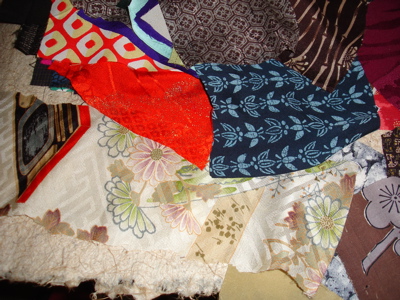
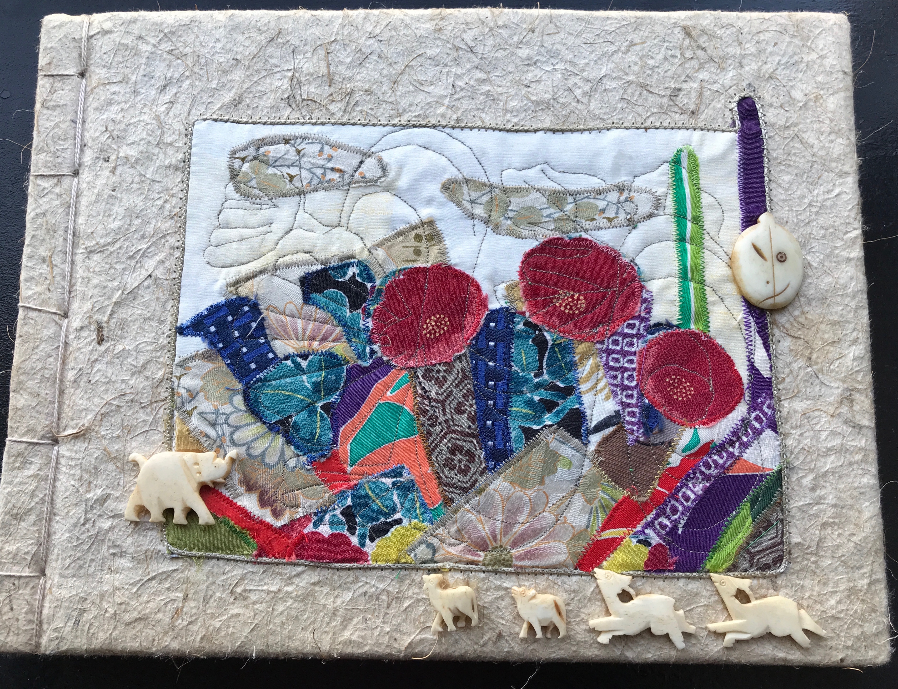
For the first one from Japan in 2007, I brought back a small package of silk scraps that I cut up and machine embroidered on Japanese Washi paper. The glued on bone bead embellishments are from my collection of beads and probably come from India.

bcab8-dsc06678_2

IMG_0006

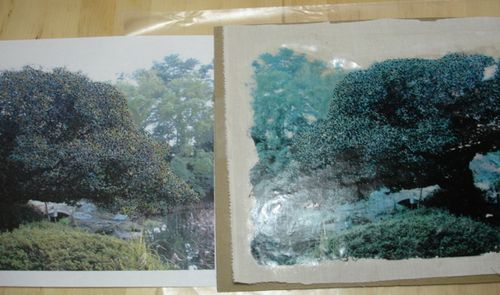
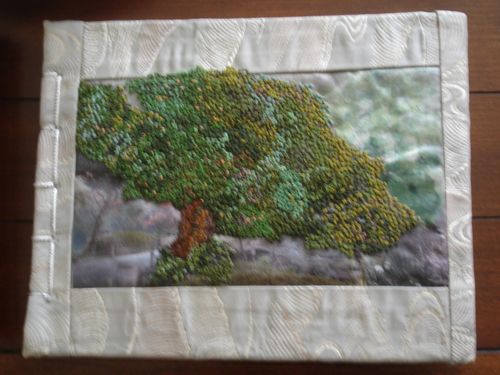
The second book is from Japan 2008. Using silk from an Obi I first made a photo transfer and then hand embroidered the tree with French knots.

4ad2a-6a00d83451b50669e201157147efaa970b-500wid03d2-6a00d83451b50669e2011571388593970c-500wi8ff13-6a00d83451b50669e20120a661a2f5970c-500wi

I’d like to say ‘never again’ to that, but I’m working on binding a fifth book with the title in French knots. I’ve been working on it, off and on, since 2013. The book block is finished–it may never get bound.

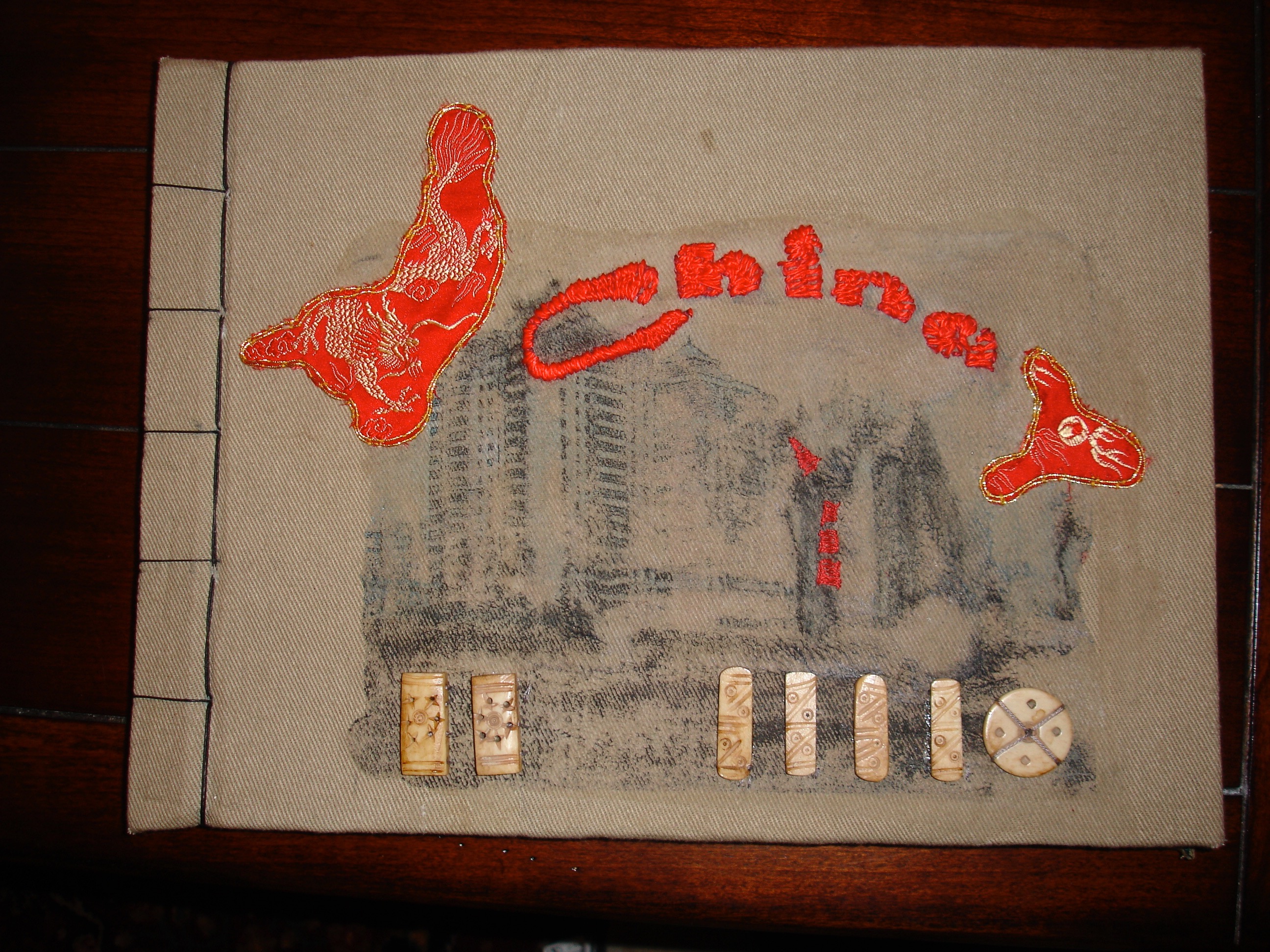
I also went to China for a month in 2008 and spent even longer thinking about the binding for this book. I began with a large piece of embroidered red silk. While China clearly has it’s elegant aspects my experience was much more concerned with grit and pollution. Finally I cut up the now dirty, gritty bag I had carried all month, used another photo transfer, a bit of the red silk, hand embroidery–not French knots and embellishments from my collection.

93c77-6a00d83451b50669e201156fbed8fb970c-500wi

China 2008

The fourth book, from a trip to Japan in 2013, is structurally similar to the other three, but instead of the stab binding I used three brass screw posts, fittingly called Chicago posts. The book is thicker than the others and the posts provide a stronger binding.

IMG_0005

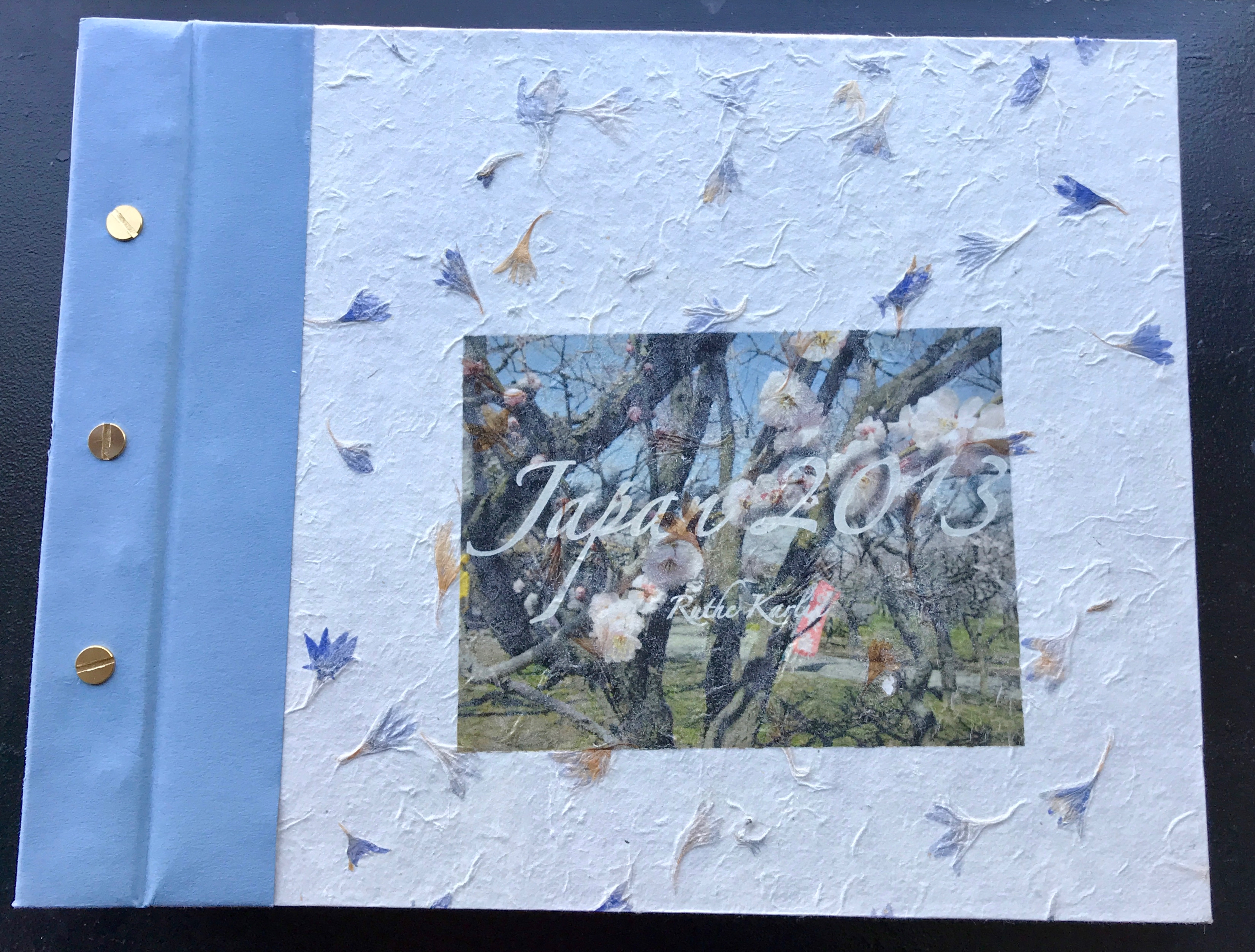
The paper covering the boards has tiny leaves embedded; the title was printed directly onto the paper. The blue border is book cloth, which covers several mistakes I made during my initial attempt at binding.

Book One from Scotland

My trip to Scotland was rich with ideas and thoughts about making books. I made a quick, first book to bring to my book-making group for our twice yearly book exchange party. This is a simple accordion photo book portraying the wonderful sunsets I found in Scotland.

IMG_3468

Pages are printed 2-up on 9″x12″ Co Mo Sketch, a soft finish, heavy drawing paper,  trimmed to 8×5″, and tabbed together. Finished book is 8.12×5.12″. Most photos were shot as panoramas on my iPhone 6.

A second copy is printed on Accent Opaque 100lb. cover, tabbed and bound similarly. Covers are Crescent board covered in Lokta and a simple collage made from previously printed pages.

IMG_3484

This book taught me some lessons about printing. My first attempt was on a paper called Super Max text. It’s a lovely paper, but it didn’t take the ink very well. I don’t use photo paper, which might give me the best results, but would not be best in a bound book. I tried a second printing on Epson Presentation paper, which also did not please me. Some images printed too harsh and some had strange color, especially the greens. Both the Co Mo Sketch and the Accent Opaque gave me the best results overall. I tried to adjust color management without making much difference.