Two more books

IMG_0060

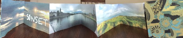
When I returned from the workshop in Scotland last year I made this book using photos of an installation by Sophie Cave in the Kelvingrove Museum in Glasgow. Structure of the book is based on a design created, I believe, by Hedi Kyle and known as a panel book. It is a simple accordion with a panel cut in each page so images rotate forward as the book is opened.

heads full

Covers are a light mat board with possibly handmade paper with botanic inclusions and a side strip of tan paper. Accordion is made of eight pieces of 100# Accent Opaque cover tabbed together. For the inside cover I enlarged two of the heads. Book is 8 5/8″ by 5 5/8″ and opens to 44 inches.

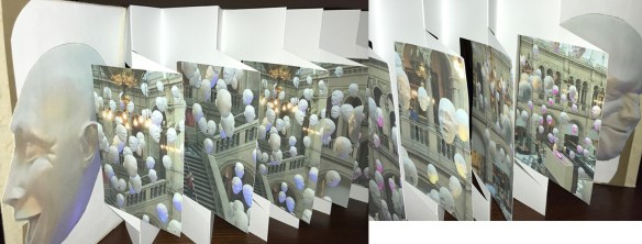
My book-making group liked this so much they asked me to teach it. This time I wanted an image over the entire page with the interest popping on the panel. I had some colorful, but unfocused images I shot of the puppet parade at First Night and used them for the background. Serendipitously, Eli took us to a House (music) festival at Millennium Park as I was thinking about this project. I took photos of people dancing, cut them out of their backgrounds in Photoshop, made silhouettes and put them on the panels, creating my House book.

img_0047-1.jpg

Although the book is simple there are many opportunities for errors, and I made all of them. So the letters on the cover were cut from pages I printed and couldn’t use. Then they were machine stitched to handmade paper I picked up years ago in the Himalayan store, possibly from Nepal. This time I used a thin book board that remained flat where the mat board curled.

IMG_0050 (1)

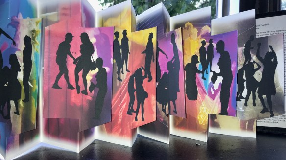
I wanted something on the back of each panel and found a poem about House music online. Additionally I added the entire poem on the inside of the front cover and a discussion about the origin of the poem inside the back cover. The book is 9 inches high by six inches wide and opens to 40 inches. Two pieces of Stonehenge Student make up the accordion with only one tab needed.


Two inspired by Scotland workshop

Many of my books take months or years of gestation before becoming concrete. I’ve been thinking for a long time about this one, which I call “Blast Zone”. Part of the series I have been creating about the climate crisis it deals with oil train explosions and derailments. Since I always try to use my own photos I was stymied. I haven’t had an opportunity to photograph a train derailment for which I am grateful, so I couldn’t figure out what to do.

Before I ever went to Scotland the title of the workshop, Mapping our way in these dystopian times, inspired me to think about the train derailments in terms of maps. I collected information about oil train derailments beginning in 2009 and using a website, http://explosive-crude-by-rail.org I created a map for each of the oil train derailments I was able to document. The blast zones show the areas half mile to one mile that are (or would be) evacuated.

IMG_3532

IMG_3462

Unlike most of my books, which are one-of-a-kind, I’m looking for wider distribution of this one. I am working with a friend to call attention to the oil trains that run through Pittsburgh. They go near the Convention Center downtown, the sports stadiums, most of the hospitals, University of Pittsburgh, Carnegie Mellon University, Google offices and the apartment buildings where my friend and I live. I have created a pdf of the book that I gave to the Sierra Club and the Fracktracker Alliance. You can download a copy here. Oil train derailments  You might live near one of those blast zones too.

The second book inspired by the workshop and nothing to do with Scotland is about my hearing loss. This may also become a best seller (at least 3 copies). All of my hearing aid wearing friends are interested. Tana, the leader of the workshop, has a heavy Slavic accent and speaks in low tones almost without opening her mouth. I had a terrible time hearing and understanding her. She was very good about it and the other participants were helpful so I only missed a few things. Several days into the workshop I was looking for inspiration. Tana suggested I use text in my work. I played with a rubber-stamp alphabet them came up with a small verse and hand-printed it. Altogether not artistic, but somehow satisfying.

Ear collage

One of the participants suggested I make a book about my hearing problems. I took the suggestion and ran with it. Problem: how to visualize hearing loss. I revised my lament:
I can hear birds sing
I can hear bells ring
But words, words are a different thing.

I used several poems found online, in particular a plea written by a mother to her preteen daughter. So much of what she wrote resonated with me. I added photos I took in situations where I couldn’t hear or understand what was being said. Below is a sample page and you can download the pdf here. hearing book

hearing book facing pages

Each of the pages are double page spreads and are bound accordion style between simple covers with only the drawing of my ear.


Book One from Scotland

My trip to Scotland was rich with ideas and thoughts about making books. I made a quick, first book to bring to my book-making group for our twice yearly book exchange party. This is a simple accordion photo book portraying the wonderful sunsets I found in Scotland.

IMG_3468

Pages are printed 2-up on 9″x12″ Co Mo Sketch, a soft finish, heavy drawing paper,  trimmed to 8×5″, and tabbed together. Finished book is 8.12×5.12″. Most photos were shot as panoramas on my iPhone 6.

A second copy is printed on Accent Opaque 100lb. cover, tabbed and bound similarly. Covers are Crescent board covered in Lokta and a simple collage made from previously printed pages.

IMG_3484

This book taught me some lessons about printing. My first attempt was on a paper called Super Max text. It’s a lovely paper, but it didn’t take the ink very well. I don’t use photo paper, which might give me the best results, but would not be best in a bound book. I tried a second printing on Epson Presentation paper, which also did not please me. Some images printed too harsh and some had strange color, especially the greens. Both the Co Mo Sketch and the Accent Opaque gave me the best results overall. I tried to adjust color management without making much difference.